BART and Income
The Observation:
After visiting some family I headed back home and took BART (Bay Area Rapid Transit) back to the East Bay from SFO. On our trip from one end of the SF Bay Area (San Francisco Bay Area) to the other, my wife mentioned how tense she felt on BART as well as the immediate areas surrounding BART. It had been a while since I had taken BART and once she had mentioned it, I was surprised to how many criminal things were occurring all around me. But when visiting the North Bay or South Bay, there didn’t seem to be nearly as much crime if any crime at all. So I asked myself a question.
The Question:
Is there a clear correlation of crime and BART stations? Or is it more of a chicken and egg dilemma.
The Plan:
Collect data from various sites that have to do with the San Francisco Bay Area.
Use QGIS to see if there are any obvious patterns.
The Execution
Part One
There was an easy-to-use ArcGIS version of the census data, but it wasn’t the most recent. So, I went over to the Census Bureau website and downloaded the entire dataset myself. The dataset was quite large, so I trimmed down the data.
After downloading the data and struggling with it for a while I learned that the Census Bureau has an API. I used their API through Python to extract exactly what I needed. By leveraging the Census Bureau API with a simple Python script, I was able to retrieve CSV format data for every city in California. Using pandas, I combined the three different datasets I retrieved from the Census Bureau: income, poverty, and unemployment.
Once I created the CSV file with all three datasets, I imported it into QGIS along with the city boundaries for California. To make the data cohesive, I joined the CSV and boundary data, a process simplified through Python.
Next, I applied an income bracket from the U.S. Census Bureau to a graduated color ramp in QGIS to visualize income levels across California.
I didn’t find any base maps that were easily accessible, so I explored the ArcGIS basemaps and found the ESRI Gray map, which suited my needs. Using the QuickMapServices plugin, I easily imported the ESRI Gray basemap into QGIS.
I wanted to focus on the San Francisco Bay Area where I lived. I used the "California 2020 TIGER/Line shapefile" provided by the Metropolitan Transportation Commission to define the Greater Bay Area. After identifying all the counties within the Bay Area, I dissolved the inner county borders to create one unified outer border for the region.
The product of everything so far is shown on the image to the right.
Part Two:
After the boundaries were fleshed out and data input, I asked myself some questions.
My first question to myself was what was a great visual representation of how terrible the SF Bay Area can be? The answer is straightforward if you have commuted by train in the Bay Area: BART
I input the BART stations as well as where the tracks were. A pattern appeared to me which may come as to no surprise to natives.
It seems as though if BART had a stop in a Bay Area city, it had lower median household income. This was not across the board or definitive but assessing the map would make one believe that BART was some sort of indicator of income.
Part Three: BART Cities vs. No BART Cities
Comparing all SF Bay Area cities that have BART stations against all SF Bay Area cities that do not have BART stations paints a fairly boring outcome.
Stats for SF Bay WITH BART
MEAN: $134,349.13
MEDIAN: $128,516.5
Stats for SF Bay WITHOUT BART
MEAN: $130,743.41
MEDIAN: $113,839.0
Above is a map of all cities in the SF Bay Area without BART stations.
Above is a map of all cities in SF Bay Area with BART stations.
Part Four: Home Prices
I decided to take a different approach and look at the relationship (if any) between median home prices and proximity to BART.
I joined my previous data on city borders with a new dataset from Zillow, which includes median housing prices in cities throughout the Bay Area.
While I was collecting the data and preparing it for analysis, I thought there was a glitch or problem. Some cities were clearly missing from my map. It took me a while to figure out the issue: I had not set the home price brackets high enough. I originally thought $2 million would be sufficient, but I ended up using a $10 million top bracket to ensure all homes were included.
The median income map was shocking so I decided to do an affordability ratio which shows how many years’ worth of income a household would need to buy a typical home. In the South Bay, it goes as high as 30 years!
San Francisco Bay Area Median Home Prices
Affordability ratio of the SF Bay Area.
CONCLUSION
Many years ago, when I visited the Streetcar Museum in San Francisco, I was shown an old newspaper article about how the North Bay didn’t want any 'riff-raff' coming from the East Bay.
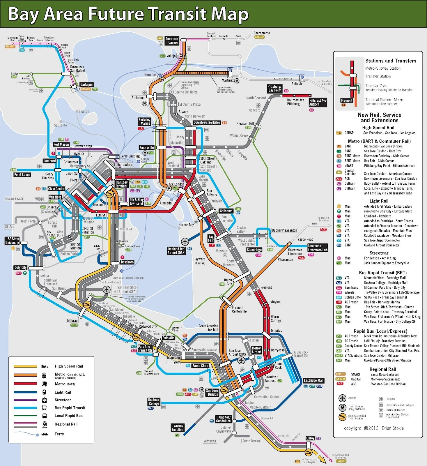
I imagine if people in the Bay saw this fantasy BART map they would wonder why this map can not be a reality.
Hopefully this project I created can be a limited look into answering that question.
Sources:
California City Boundaries : https://gis-calema.opendata.arcgis.com/datasets/CalEMA::enriched-california-incorporated-cities/explore?location=37.964540%2C-121.995446%2C11.15
Home Prices: https://www.zillow.com/research/data/
Demographic data: https://www.census.gov/


